library(marginaleffects)
dat = get_dataset("thornton")
mod = glm(outcome ~ incentive + agecat, data = dat, family = binomial)5 Predictions
The parameter estimates obtained by fitting a statistical model are rarely the main object of interest in a data analysis. Instead of focusing on those raw estimates, a good starting point is often to compute model-based predictions for different combinations of predictor values. This allows an analyst to report results on a scale that makes intuitive sense to their readers, colleagues, and stakeholders.
What is a model-based prediction? In this book, we consider that
A prediction is the outcome expected by a fitted model for a given combination of predictor values.
This definition is in line with the familiar concept of “fitted value,” but it differs from a “forecast” or “out-of-sample prediction” (Hyndman and Athanasopoulos 2018). For our purposes, the word “prediction” need not imply that we hope to forecast the future, or that we are trying to extrapolate to unseen data. It simply denotes the best guess of a fitted model for specific predictor values.
Model-based predictions are often the main quantity of interest in a data analysis. They allow us to answer a wide variety of questions, such as:
- What is the expected probability that a 50-year-old smoker develops heart disease, adjusting for diet, exercise, and family history?
- What is the expected probability that a football team wins a game, considering the team’s recent performance, injuries, and opponent strength?
- What is the expected turnout in municipal elections, accounting for national trends and local demographic characteristics?
- What is the expected price of a three-bedroom house in a suburban area, controlling for floor area and market conditions?
All of these descriptive questions can be answered using model-based predictions. Predictions are an intrinsically interesting quantity. In Chapters 6 and 7, we will see that they are also a fundamental building block to analyze the effects of interventions, or the association between variables.
The current chapter illustrates how to compute and report predictions for models estimated with the Thornton (2008) data. We proceed in order, through each component of the conceptual framework laid out in Chapter 3: (1) quantity, (2) predictors, (3) aggregation, (4) uncertainty, and (5) tests. The chapter concludes by showing different ways to visualize predictions.
5.1 Quantity
To begin, it is useful to see how predictions are built in one particular case. Consider a logistic regression model estimated using the Thornton (2008) HIV dataset.
\[ Pr(O=1) = g\left (\beta_1 + \beta_2 \cdot I + \beta_3 \cdot A_{18-35} + \beta_4 \cdot A_{>35} \right ), \tag{5.1}\]
where O is a binary variable equal to 1 if the study participant traveled to the test center to learn the outcome of their HIV test; I is a binary variable equal to 1 if the participant received a monetary incentive; and the other two predictors are indicators for the age category to which a participant belongs, with omitted category \(A_{<18}\).
The letter \(g\) represents the standard logistic function \(g(x) = \frac{1}{1 + e^{-x}}\). Applying this function ensures that the linear component inside the parentheses of Equation 5.1 gets rescaled to the \([0,1]\) interval in order to respect the natural (probability) scale of the binary outcome.
Now, we load the marginaleffects package, read the Thornton data, and estimate a logistic regression model using the glm() function.
import polars as pl
import numpy as np
from marginaleffects import *
from plotnine import *
from scipy.stats import norm
from statsmodels.formula.api import logit, ols

dat = get_dataset("thornton")
dat = dat.drop_nulls(subset = ["incentive"])
mod = logit("outcome ~ incentive + agecat",
  data=dat.to_pandas()).fit()
Optimization terminated successfully.
Current function value: 0.540019
Iterations 5The estimated coefficients are:
b = coef(mod)
b
(Intercept) incentive agecat18 to 35 agecat>35
-0.78232923 1.99229719 0.04368393 0.24780479 b = mod.params
print(b)Intercept -0.782329
agecat[T.18 to 35] 0.043684
agecat[T.>35] 0.247805
incentive 1.992297
dtype: float64For clarity of presentation, we substitute these estimates into the model equation.
\[ Pr(O=1) = g\left (-0.782 + 1.992 \cdot I + 0.044 \cdot A_{18-35} + 0.248 \cdot A_{>35} \right ) \tag{5.2}\]
To make a prediction for a particular individual, we simply plug-in the characteristics of that person into Equation 5.2. For example, the predicted probability that outcome equals 1 for an 18 to 35-year-old in the treatment group is
\[\begin{align*} Pr(O=1) = g\left (-0.782 + 1.992 \cdot 1 + 0.044 \cdot 1 + 0.248 \cdot 0 \right )\\ \end{align*}\]
The predicted probability that Outcome equals 1 for someone above 35 years-old in the control group is
\[\begin{align*} Pr(O=1) = g\left (-0.782 + 1.992 \cdot 0 + 0.044 \cdot 0 + 0.248 \cdot 1 \right ) \end{align*}\]
These expressions can be evaluated in two steps. First, we compute the linear—or link scale—component by evaluating the expression inside the parentheses.
linpred_treatment_younger = b.iloc[0] + b.iloc[3] * 1 + \
  b.iloc[1] * 1 + b.iloc[2] * 0
print(linpred_treatment_younger)1.2536518758953992linpred_control_older = b.iloc[0] + b.iloc[3] * 0 + \
b.iloc[1] * 0 + b.iloc[2] * 1
print(linpred_control_older)-0.5345244420522486Link scale predictions from a logit model are expressed on the log odds scale. In this example, they include a negative value and a value greater than one. To many, this will feel incongruous, because the outcome is a binary variable, with a probability bounded by 0 and 1.
The second step of the computation is thus to apply the logistic function \(g\), to ensure that predictions respect the natural scale of the data.1
Our model expects that the probability of seeking information about one’s HIV status is 78% for a young adult who receives a monetary incentive, and 37% for an older participant who does not receive an incentive.
Computing predictions manually is useful for pedagogical purposes, but it is labor-intensive and error-prone. The commands above are also limiting, because they only apply to one very specific model.
Instead of manual computation, we can use the predictions() function from the marginaleffects package. This function can be applied in consistent fashion across more than 100 different classes of statistical models.
First, we build a data frame of predictor values—a grid—where each row represents a different individual.
grid = data.frame(agecat = c("18 to 35", ">35"), incentive = c(1, 0))
grid
agecat incentive
1 18 to 35 1
2 >35 0grid = pl.DataFrame({
"agecat": ["18 to 35", ">35"],
"incentive": [1, 0]
})
grid
shape: (2, 2)
| agecat | incentive |
|---|---|
| str | i64 |
| "18 to 35" | 1 |
| ">35" | 0 |
Then, we call the predictions() function, using the newdata argument to specify the predictor values, and the type argument to set the scale (link or response):
predictions(mod, newdata = grid, type = "link")| Estimate | Std. Error | z | Pr(>|z|) | 2.5 % | 97.5 % |
|---|---|---|---|---|---|
| 1.254 | 0.0691 | 18.15 | <0.001 | 1.118 | 1.389 |
| -0.535 | 0.1013 | -5.28 | <0.001 | -0.733 | -0.336 |
predictions(mod, newdata = grid)shape: (2, 7)
┌──────────┬───────────┬──────┬─────────┬─────┬───────┬───────┐
│ Estimate ┆ Std.Error ┆ z ┆ P(>|z|) ┆ S ┆ 2.5% ┆ 97.5% │
│ --- ┆ --- ┆ --- ┆ --- ┆ --- ┆ --- ┆ --- │
│ str ┆ str ┆ str ┆ str ┆ str ┆ str ┆ str │
╞══════════╪═══════════╪══════╪═════════╪═════╪═══════╪═══════╡
│ 0.778 ┆ 0.0119 ┆ 65.2 ┆ 0 ┆ inf ┆ 0.755 ┆ 0.801 │
│ 0.369 ┆ 0.0236 ┆ 15.7 ┆ 0 ┆ inf ┆ 0.323 ┆ 0.416 │
└──────────┴───────────┴──────┴─────────┴─────┴───────┴───────┘These results are exactly identical to the link scale predictions that we computed manually above. This is reassuring but, in a logit model, link scale predictions are hard to interpret.
To communicate our results clearly, it is usually best to make predictions on the same scale as the outcome variable. Doing this makes our estimates easier to interpret, since they can be compared directly to observed values of the outcome variable. For this reason, the default behavior of predictions() is to return predictions on the response scale.
predictions(mod, newdata = grid)| Estimate | Pr(>|z|) | 2.5 % | 97.5 % |
|---|---|---|---|
| 0.778 | <0.001 | 0.754 | 0.800 |
| 0.369 | <0.001 | 0.325 | 0.417 |
predictions(mod, newdata=grid)shape: (2, 7)
┌──────────┬───────────┬──────┬─────────┬─────┬───────┬───────┐
│ Estimate ┆ Std.Error ┆ z ┆ P(>|z|) ┆ S ┆ 2.5% ┆ 97.5% │
│ --- ┆ --- ┆ --- ┆ --- ┆ --- ┆ --- ┆ --- │
│ str ┆ str ┆ str ┆ str ┆ str ┆ str ┆ str │
╞══════════╪═══════════╪══════╪═════════╪═════╪═══════╪═══════╡
│ 0.778 ┆ 0.0119 ┆ 65.2 ┆ 0 ┆ inf ┆ 0.755 ┆ 0.801 │
│ 0.369 ┆ 0.0236 ┆ 15.7 ┆ 0 ┆ inf ┆ 0.323 ┆ 0.416 │
└──────────┴───────────┴──────┴─────────┴─────┴───────┴───────┘In the rest of this chapter, we show that the marginaleffects package makes it easy to compute various types of predictions, aggregate, and conduct statistical tests on them.
5.2 Predictors
Predictions are conditional quantities, in the sense that they typically depend on the values of all the predictor variables in a model. To compute a prediction, the analyst must fix all the variables on the right-hand side of the model equation, that is, they must choose a grid.
The choice of grid depends on the researcher’s goals. The profiles it holds could correspond to actual observations in the original data, or they could represent unseen, hypothetical, or representative units. To illustrate, let’s consider a slight modification of the model estimated in Section 5.1. In addition to the incentive and agecat predictors, we now include a numeric predictor to account for the distance between a study participant’s home and the test center where they can learn their HIV status.
mod = glm(outcome ~ incentive + agecat + distance,
  data = dat, family = binomial)
mod = logit("outcome ~ incentive + agecat + distance",
data=dat.to_pandas()).fit()Optimization terminated successfully.
Current function value: 0.535973
Iterations 5With this model, we can make predictions on various grids: empirical, interesting, representative, balanced, or counterfactual.2
5.2.1 Empirical grid
By default, the predictions() function uses the full original dataset as a grid, that is, it uses the empirical distribution of predictors.3 This means that predictions() will compute fitted values for each one of the rows in the dataset used to fit the model.
p = predictions(mod)
p| Estimate | Pr(>|z|) | 2.5 % | 97.5 % |
|---|---|---|---|
| 0.365 | <0.001 | 0.297 | 0.439 |
| 0.354 | <0.001 | 0.288 | 0.426 |
| 0.265 | <0.001 | 0.209 | 0.330 |
| 0.300 | <0.001 | 0.241 | 0.365 |
| 0.334 | <0.001 | 0.271 | 0.402 |
| 2815 rows omitted | 2815 rows omitted | 2815 rows omitted | 2815 rows omitted |
| 0.833 | <0.001 | 0.809 | 0.855 |
| 0.840 | <0.001 | 0.815 | 0.862 |
| 0.833 | <0.001 | 0.809 | 0.855 |
| 0.827 | <0.001 | 0.803 | 0.849 |
| 0.789 | <0.001 | 0.761 | 0.814 |
p = predictions(mod)
p
shape: (2_825, 7)
┌──────────┬───────────┬──────┬─────────┬─────┬───────┬───────┐
│ Estimate ┆ Std.Error ┆ z ┆ P(>|z|) ┆ S ┆ 2.5% ┆ 97.5% │
│ --- ┆ --- ┆ --- ┆ --- ┆ --- ┆ --- ┆ --- │
│ str ┆ str ┆ str ┆ str ┆ str ┆ str ┆ str │
╞══════════╪═══════════╪══════╪═════════╪═════╪═══════╪═══════╡
│ 0.365 ┆ 0.0365 ┆ 10 ┆ 0 ┆ inf ┆ 0.294 ┆ 0.437 │
│ 0.354 ┆ 0.0354 ┆ 9.99 ┆ 0 ┆ inf ┆ 0.285 ┆ 0.424 │
│ 0.265 ┆ 0.031 ┆ 8.56 ┆ 0 ┆ inf ┆ 0.205 ┆ 0.326 │
│ 0.3 ┆ 0.0318 ┆ 9.43 ┆ 0 ┆ inf ┆ 0.237 ┆ 0.362 │
│ 0.334 ┆ 0.0337 ┆ 9.9 ┆ 0 ┆ inf ┆ 0.267 ┆ 0.4 │
│ … ┆ … ┆ … ┆ … ┆ … ┆ … ┆ … │
│ 0.833 ┆ 0.0118 ┆ 70.8 ┆ 0 ┆ inf ┆ 0.81 ┆ 0.856 │
│ 0.84 ┆ 0.012 ┆ 70 ┆ 0 ┆ inf ┆ 0.816 ┆ 0.863 │
│ 0.833 ┆ 0.0118 ┆ 70.8 ┆ 0 ┆ inf ┆ 0.81 ┆ 0.856 │
│ 0.827 ┆ 0.0116 ┆ 71 ┆ 0 ┆ inf ┆ 0.804 ┆ 0.85 │
│ 0.789 ┆ 0.0136 ┆ 58.1 ┆ 0 ┆ inf ┆ 0.762 ┆ 0.816 │
└──────────┴───────────┴──────┴─────────┴─────┴───────┴───────┘The p object created by predictions() includes the fitted values for each observation in the dataset, along with test statistics like \(p\) values and confidence intervals. p is a standard data frame, which means that we can manipulate it using the usual R or Python commands.
For example, we can check that the data frame includes 2825 and 15 columns:
dim(p)[1] 2825 15p.shape(2825, 17)We can list the available column names:
colnames(p) [1] "rowid" "estimate" "p.value" "s.value" "conf.low" "conf.high"
[7] "df" "village" "outcome" "distance" "amount" "incentive"
[13] "age" "hiv2004" "agecat" p.columns['rowid', 'estimate', 'std_error', 'statistic', 'p_value', 's_value', 'conf_low', 'conf_high', 'index', 'village', 'outcome', 'distance', 'amount', 'incentive', 'age', 'hiv2004', 'agecat']And we can extract individual columns and cells using the standard $ or [] syntaxes, or using data manipulation packages like dplyr or data.table:
p[1:4, "estimate"][1] 0.3652679 0.3540617 0.2653133 0.2997423p[:4, "estimate"]
shape: (4,)
| estimate |
|---|
| f64 |
| 0.365268 |
| 0.354062 |
| 0.265313 |
| 0.299742 |
Users should be mindful of the fact that, by default, the \(p\) values held in this data frame correspond to a hypothesis test against a null of zero. In Section 5.5, we will see that it is easy to change this default null using the hypothesis argument.
5.2.2 Interesting grid
In many cases, analysts are not interested in model-based predictions for each observation in their sample. Instead, they may prefer to build a grid of predictor values that hold particular scientific or commercial interest.4
In marginaleffects, the main strategy to define custom grids is to use the newdata argument and the datagrid() function. This function creates a “typical” dataset with all variables held at their means or modes, except for those we explicitly define.
datagrid(agecat = "18 to 35", incentive = [0,1], model = mod)
shape: (2, 9)
| index | village | outcome | distance | amount | age | hiv2004 | agecat | incentive |
|---|---|---|---|---|---|---|---|---|
| f64 | f64 | i64 | f64 | f64 | f64 | f64 | enum | i64 |
| 1412.0 | 62.870442 | 1 | 2.014541 | 1.005349 | 33.396106 | 0.057699 | "18 to 35" | 0 |
| 1412.0 | 62.870442 | 1 | 2.014541 | 1.005349 | 33.396106 | 0.057699 | "18 to 35" | 1 |
We can feed this datagrid() function to the newdata argument of predictions().5
p = predictions(mod,
  newdata = datagrid(agecat = "18 to 35", incentive = c(0, 1))
)
p| agecat | incentive | Estimate | Pr(>|z|) | 2.5 % | 97.5 % |
|---|---|---|---|---|---|
| 18 to 35 | 0 | 0.318 | <0.001 | 0.279 | 0.361 |
| 18 to 35 | 1 | 0.780 | <0.001 | 0.755 | 0.802 |
p = predictions(mod,
  newdata=datagrid(agecat = "18 to 35", incentive = [0,1]))
p
shape: (2, 9)
┌──────────┬───────────┬──────────┬───────────┬───┬─────────┬─────┬───────┬───────┐
│ agecat ┆ incentive ┆ Estimate ┆ Std.Error ┆ … ┆ P(>|z|) ┆ S ┆ 2.5% ┆ 97.5% │
│ --- ┆ --- ┆ --- ┆ --- ┆ ┆ --- ┆ --- ┆ --- ┆ --- │
│ enum ┆ str ┆ str ┆ str ┆ ┆ str ┆ str ┆ str ┆ str │
╞══════════╪═══════════╪══════════╪═══════════╪═══╪═════════╪═════╪═══════╪═══════╡
│ 18 to 35 ┆ 0 ┆ 0.318 ┆ 0.021 ┆ … ┆ 0 ┆ inf ┆ 0.277 ┆ 0.359 │
│ 18 to 35 ┆ 1 ┆ 0.78 ┆ 0.0119 ┆ … ┆ 0 ┆ inf ┆ 0.756 ┆ 0.803 │
└──────────┴───────────┴──────────┴───────────┴───┴─────────┴─────┴───────┴───────┘This shows that the estimated probability of seeking one’s HIV status is about 32% for a participant who is between 18 and 35 years old, did not receive a monetary incentive, and lives the average distance from the center.
One useful feature is that we can pass functions to datagrid(). These functions will be applied to the named variables, and the output used to construct the grid.
predictions(mod,
  newdata = datagrid(distance = 2, agecat = unique, incentive = max)
)| distance | agecat | incentive | Estimate | Pr(>|z|) | 2.5 % | 97.5 % |
|---|---|---|---|---|---|---|
| 2 | <18 | 1 | 0.774 | <0.001 | 0.725 | 0.816 |
| 2 | 18 to 35 | 1 | 0.780 | <0.001 | 0.756 | 0.802 |
| 2 | >35 | 1 | 0.815 | <0.001 | 0.791 | 0.837 |
predictions(mod,
  newdata=datagrid(
    distance = 2,
    agecat = dat["agecat"].unique(),
    incentive = dat["incentive"].max()))
shape: (3, 10)
┌──────────┬──────────┬───────────┬──────────┬───┬─────────┬─────┬───────┬───────┐
│ distance ┆ agecat ┆ incentive ┆ Estimate ┆ … ┆ P(>|z|) ┆ S ┆ 2.5% ┆ 97.5% │
│ --- ┆ --- ┆ --- ┆ --- ┆ ┆ --- ┆ --- ┆ --- ┆ --- │
│ str ┆ enum ┆ str ┆ str ┆ ┆ str ┆ str ┆ str ┆ str │
╞══════════╪══════════╪═══════════╪══════════╪═══╪═════════╪═════╪═══════╪═══════╡
│ 2 ┆ <18 ┆ 1 ┆ 0.774 ┆ … ┆ 0 ┆ inf ┆ 0.728 ┆ 0.82 │
│ 2 ┆ 18 to 35 ┆ 1 ┆ 0.78 ┆ … ┆ 0 ┆ inf ┆ 0.757 ┆ 0.803 │
│ 2 ┆ >35 ┆ 1 ┆ 0.815 ┆ … ┆ 0 ┆ inf ┆ 0.792 ┆ 0.838 │
└──────────┴──────────┴───────────┴──────────┴───┴─────────┴─────┴───────┴───────┘5.2.3 Representative grid
Sometimes, analysts do not want fine-grained control over the values of each predictor, but would rather compute predictions for some representative individual.6 For example, we can compute a “Prediction at the Mean,” that is, a prediction for a hypothetical representative individual whose personal characteristics are exactly average on numeric variables, and modal on categorical variables.
To achieve this, we can either call the datagrid() function without specifying the value of any variable, or we can use the "mean" shortcut.
p = predictions(mod, newdata = "mean")
p| Estimate | Pr(>|z|) | 2.5 % | 97.5 % |
|---|---|---|---|
| 0.78 | <0.001 | 0.755 | 0.802 |
predictions(mod, newdata="mean")shape: (1, 7)
┌──────────┬───────────┬──────┬─────────┬─────┬───────┬───────┐
│ Estimate ┆ Std.Error ┆ z ┆ P(>|z|) ┆ S ┆ 2.5% ┆ 97.5% │
│ --- ┆ --- ┆ --- ┆ --- ┆ --- ┆ --- ┆ --- │
│ str ┆ str ┆ str ┆ str ┆ str ┆ str ┆ str │
╞══════════╪═══════════╪══════╪═════════╪═════╪═══════╪═══════╡
│ 0.78 ┆ 0.0119 ┆ 65.3 ┆ 0 ┆ inf ┆ 0.756 ┆ 0.803 │
└──────────┴───────────┴──────┴─────────┴─────┴───────┴───────┘Our model expects that an individual with average or modal characteristics has a 78% probability of traveling to the test center to learn their HIV status.
Representative grids can be useful in some contexts, but they are not always the best choice. Sometimes there is simply no one in our sample who is exactly average on all relevant dimensions. When this average individual is fictional, the associated prediction may not be scientifically interesting or practically relevant.
5.2.4 Balanced grid
A common strategy in the analysis of experiments is to compute estimates on a “balanced grid.”7 This type of grid includes one row for each combination of unique values for the categorical (or binary) predictors, holding numeric variables at their means. To achieve this, we can either call datagrid() or use the "balanced" shortcut. These two calls are equivalent:
# predictions(mod, newdata = datagrid(
#   agecat = unique, incentive = unique, distance = mean
# ))

predictions(mod, newdata = "balanced")| Estimate | Pr(>|z|) | 2.5 % | 97.5 % |
|---|---|---|---|
| 0.311 | <0.001 | 0.251 | 0.377 |
| 0.773 | <0.001 | 0.724 | 0.816 |
| 0.318 | <0.001 | 0.279 | 0.361 |
| 0.780 | <0.001 | 0.755 | 0.802 |
| 0.367 | <0.001 | 0.322 | 0.415 |
| 0.815 | <0.001 | 0.791 | 0.837 |
# predictions(mod,
#   newdata = datagrid(
#     agecat = dat["agecat"].unique(),
#     incentive = dat["incentive"].unique(),
#     distance = dat["distance"].mean()))

predictions(mod, newdata = "balanced")
shape: (6, 7)
┌──────────┬───────────┬──────┬─────────┬─────┬───────┬───────┐
│ Estimate ┆ Std.Error ┆ z ┆ P(>|z|) ┆ S ┆ 2.5% ┆ 97.5% │
│ --- ┆ --- ┆ --- ┆ --- ┆ --- ┆ --- ┆ --- │
│ str ┆ str ┆ str ┆ str ┆ str ┆ str ┆ str │
╞══════════╪═══════════╪══════╪═════════╪═════╪═══════╪═══════╡
│ 0.311 ┆ 0.0323 ┆ 9.63 ┆ 0 ┆ inf ┆ 0.247 ┆ 0.374 │
│ 0.773 ┆ 0.0234 ┆ 33 ┆ 0 ┆ inf ┆ 0.727 ┆ 0.819 │
│ 0.318 ┆ 0.021 ┆ 15.2 ┆ 0 ┆ inf ┆ 0.277 ┆ 0.359 │
│ 0.78 ┆ 0.0119 ┆ 65.3 ┆ 0 ┆ inf ┆ 0.756 ┆ 0.803 │
│ 0.367 ┆ 0.0237 ┆ 15.5 ┆ 0 ┆ inf ┆ 0.321 ┆ 0.414 │
│ 0.815 ┆ 0.0117 ┆ 69.4 ┆ 0 ┆ inf ┆ 0.792 ┆ 0.838 │
└──────────┴───────────┴──────┴─────────┴─────┴───────┴───────┘A balanced grid is often used with randomized experiments when the analyst wishes to give equal weight to each combination of treatment conditions in the calculation of marginal means.8
5.2.5 Counterfactual grid
Yet another set of predictor profiles to consider is the “counterfactual grid.” The predictions made on such a grid allow us to answer questions such as:
What would the predicted outcomes be in our observed sample if everyone had received the treatment, or if everyone had received the control?
To create a counterfactual grid, we duplicate the full dataset, once for every value of the focal variable. For instance, if our dataset includes 2825 rows and we want to compute predictions for each value of the incentive variable (0 and 1), the counterfactual grid will include 5650 rows.
To make predictions on a counterfactual grid, we can call the datagrid() function with its grid_type="counterfactual" argument. Alternatively, we can use the variables argument to specify counterfactual values for the focal variable.
p = predictions(mod, variables = list(incentive = 0:1))
dim(p)
[1] 5650 12p = predictions(mod, variables = {"incentive": [0, 1]})
p.shape(5650, 18)These predictions are interesting, because they give us a first look at the kinds of counterfactual (potentially causal) queries that we will explore in Chapter 6. We can ask:
For each individual in the Thornton (2008) sample, what is the predicted probability of seeking information about HIV status in the counterfactual worlds where they receive a monetary incentive, and where they do not?
To answer this question, we rearrange the data and plot it.
library(ggplot2)

p = data.frame(
  Control = p[p$incentive == 0, "estimate"],
  Treatment = p[p$incentive == 1, "estimate"])

ggplot(p, aes(Control, Treatment)) +
  geom_abline(intercept = 0, slope = 1, linetype = "dashed") +
  geom_point() +
  labs(x = "Pr(outcome=1) when incentive = 0",
       y = "Pr(outcome=1) when incentive = 1") +
  xlim(0, 1) + ylim(0, 1) + coord_equal()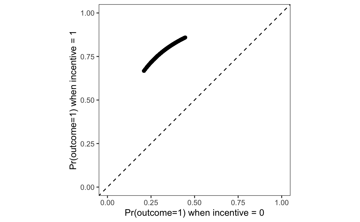
p = pl.DataFrame({
    "Control": p.filter(pl.col("incentive") == 0)["estimate"],
    "Treatment": p.filter(pl.col("incentive") == 1)["estimate"]
})
plot = (
  ggplot(p, aes(x="Control", y="Treatment")) +
  geom_point() +
  geom_abline(
    intercept=0, slope=1, linetype="--", color="grey") +
  labs(
    x="Pr(outcome=1) when incentive = 0",
    y="Pr(outcome=1) when incentive = 1") +
  xlim(0, 1) +
  ylim(0, 1) +
  theme_minimal()
)
plot.show()
On this graph, each point represents a single study participant.9 The x-axis shows the predicted probability that Outcome equals 1 for an observed individual, after we artificially fix the incentive variable to 0. The y-axis shows the predicted probability that Outcome equals 1 for an individual with the same socio-demographic characteristics, after we artificially fix the incentive variable to 1. Each point thus shows what would be expected to happen if each individual did or did not receive the treatment.
Every point is well above the 45 degree line. This means that, for every observed combination of predictor values, for every participant in the study, our model says that changing the incentive variable from 0 to 1 increases the predicted probability that the person will seek to learn their HIV status.
5.3 Aggregation
Computing predictions for a large grid or for every observation in a dataset is useful, but the results can feel unwieldy. This section makes two principal arguments. First, it often makes sense to compute aggregated statistics, such as the average predicted outcome across the whole dataset, or by subgroups of the data. Second, the grid across which we aggregate can make a big difference to the results.
An “average prediction” is the outcome of a two step process. First, we compute predictions (fitted values) for each row in the original dataset. Then, we take the average of those predictions. This can be done manually by calling the predictions() function and taking the mean of estimates.
p = predictions(mod)
mean(p$estimate)
[1] 0.6916814p = predictions(mod)
p["estimate"].mean()0.6916814159292035Alternatively, we can use the avg_predictions() function, which is a wrapper around predictions() that computes the average prediction directly.
avg_predictions(mod)| Estimate | Std. Error | z | Pr(>|z|) | 2.5 % | 97.5 % |
|---|---|---|---|---|---|
| 0.692 | 0.00791 | 87.5 | <0.001 | 0.676 | 0.707 |
avg_predictions(mod)shape: (1, 7)
┌──────────┬───────────┬──────┬─────────┬─────┬───────┬───────┐
│ Estimate ┆ Std.Error ┆ z ┆ P(>|z|) ┆ S ┆ 2.5% ┆ 97.5% │
│ --- ┆ --- ┆ --- ┆ --- ┆ --- ┆ --- ┆ --- │
│ str ┆ str ┆ str ┆ str ┆ str ┆ str ┆ str │
╞══════════╪═══════════╪══════╪═════════╪═════╪═══════╪═══════╡
│ 0.692 ┆ 0.00791 ┆ 87.5 ┆ 0 ┆ inf ┆ 0.676 ┆ 0.707 │
└──────────┴───────────┴──────┴─────────┴─────┴───────┴───────┘The average predicted probability of seeking information about one’s HIV status, across all the study participants in the Thornton (2008) sample, is about 69%.
Now, imagine that we want to know if the average predicted probability of outcome=1 differs across age categories. To check this, we make the same function call, but add the by argument.
p = avg_predictions(mod, by = "agecat")
p| agecat | Estimate | Std. Error | z | Pr(>|z|) | 2.5 % | 97.5 % |
|---|---|---|---|---|---|---|
| <18 | 0.670 | 0.0240 | 27.9 | <0.001 | 0.623 | 0.717 |
| 18 to 35 | 0.673 | 0.0116 | 58.1 | <0.001 | 0.650 | 0.695 |
| >35 | 0.720 | 0.0121 | 59.5 | <0.001 | 0.697 | 0.744 |
p = avg_predictions(mod, by="agecat")
p
shape: (3, 8)
┌──────────┬──────────┬───────────┬──────┬─────────┬─────┬───────┬───────┐
│ agecat ┆ Estimate ┆ Std.Error ┆ z ┆ P(>|z|) ┆ S ┆ 2.5% ┆ 97.5% │
│ --- ┆ --- ┆ --- ┆ --- ┆ --- ┆ --- ┆ --- ┆ --- │
│ enum ┆ str ┆ str ┆ str ┆ str ┆ str ┆ str ┆ str │
╞══════════╪══════════╪═══════════╪══════╪═════════╪═════╪═══════╪═══════╡
│ <18 ┆ 0.67 ┆ 0.024 ┆ 27.9 ┆ 0 ┆ inf ┆ 0.623 ┆ 0.717 │
│ 18 to 35 ┆ 0.673 ┆ 0.0116 ┆ 58.1 ┆ 0 ┆ inf ┆ 0.65 ┆ 0.695 │
│ >35 ┆ 0.72 ┆ 0.0121 ┆ 59.5 ┆ 0 ┆ inf ┆ 0.697 ┆ 0.744 │
└──────────┴──────────┴───────────┴──────┴─────────┴─────┴───────┴───────┘The average predicted probability of seeking one’s test result is about 67% for minors, and 72% for those above 35 years old. In Section 5.5 we will formally test if the difference between those two average predictions is statistically significant.
So far, we have taken averages over the empirical distribution of covariates, but analysts are not limited to that grid. One common alternative is to compute “marginal means” by averaging predictions across a balanced grid of predictors.10 This is useful in experimental settings, when the observed sample is not representative of the population, and when we want to marginalize while giving equal weight to each treatment condition.
To compute marginal means, we call the same function, using the newdata and by arguments.
p = avg_predictions(mod, newdata = "balanced", by = "agecat")
p| agecat | Estimate | Std. Error | z | Pr(>|z|) | 2.5 % | 97.5 % |
|---|---|---|---|---|---|---|
| <18 | 0.542 | 0.0261 | 20.7 | <0.001 | 0.491 | 0.593 |
| 18 to 35 | 0.549 | 0.0135 | 40.6 | <0.001 | 0.522 | 0.575 |
| >35 | 0.591 | 0.0151 | 39.0 | <0.001 | 0.561 | 0.621 |
p = avg_predictions(mod, newdata="balanced", by="agecat")
p
shape: (3, 8)
┌──────────┬──────────┬───────────┬──────┬─────────┬─────┬───────┬───────┐
│ agecat ┆ Estimate ┆ Std.Error ┆ z ┆ P(>|z|) ┆ S ┆ 2.5% ┆ 97.5% │
│ --- ┆ --- ┆ --- ┆ --- ┆ --- ┆ --- ┆ --- ┆ --- │
│ enum ┆ str ┆ str ┆ str ┆ str ┆ str ┆ str ┆ str │
╞══════════╪══════════╪═══════════╪══════╪═════════╪═════╪═══════╪═══════╡
│ <18 ┆ 0.542 ┆ 0.0261 ┆ 20.7 ┆ 0 ┆ inf ┆ 0.491 ┆ 0.593 │
│ 18 to 35 ┆ 0.549 ┆ 0.0135 ┆ 40.6 ┆ 0 ┆ inf ┆ 0.522 ┆ 0.575 │
│ >35 ┆ 0.591 ┆ 0.0151 ┆ 39 ┆ 0 ┆ inf ┆ 0.561 ┆ 0.621 │
└──────────┴──────────┴───────────┴──────┴─────────┴─────┴───────┴───────┘Notice that the results are very different from the average predictions computed on the empirical grid. Now, the average predicted probability of seeking one’s test result is estimated at 54% for minors, and 59% for those above 35 years old.
The reason for this drastic change is that a balanced grid gives equal weight to each combination of categorical variables, while an empirical grid gives more weight to predictor values that are more frequent in the observed data. It turns out that, in the Thornton (2008) dataset, more participants belonged to the treatment than to the control group.
table(dat$incentive)
   0    1
621 2204 dat["incentive"].value_counts()
shape: (2, 2)
| incentive | count |
|---|---|
| i32 | u32 |
| 1 | 2204 |
| 0 | 621 |
Therefore, when we compute an average prediction on the empirical distribution, predicted outcomes in the incentive=1 group are given more weight. This matters, because the average predicted probability that Outcome equals 1 is much higher in the treatment group than in the control group:
avg_predictions(mod, by = "incentive")| incentive | Estimate | Std. Error | z | Pr(>|z|) | 2.5 % | 97.5 % |
|---|---|---|---|---|---|---|
| 0 | 0.340 | 0.01890 | 18.0 | <0.001 | 0.303 | 0.377 |
| 1 | 0.791 | 0.00862 | 91.7 | <0.001 | 0.774 | 0.808 |
avg_predictions(mod, by="incentive")shape: (2, 8)
┌───────────┬──────────┬───────────┬──────┬─────────┬─────┬───────┬───────┐
│ incentive ┆ Estimate ┆ Std.Error ┆ z ┆ P(>|z|) ┆ S ┆ 2.5% ┆ 97.5% │
│ --- ┆ --- ┆ --- ┆ --- ┆ --- ┆ --- ┆ --- ┆ --- │
│ str ┆ str ┆ str ┆ str ┆ str ┆ str ┆ str ┆ str │
╞═══════════╪══════════╪═══════════╪══════╪═════════╪═════╪═══════╪═══════╡
│ 0 ┆ 0.34 ┆ 0.0189 ┆ 18 ┆ 0 ┆ inf ┆ 0.303 ┆ 0.377 │
│ 1 ┆ 0.791 ┆ 0.00862 ┆ 91.7 ┆ 0 ┆ inf ┆ 0.774 ┆ 0.808 │
└───────────┴──────────┴───────────┴──────┴─────────┴─────┴───────┴───────┘Thus, the group-wise averages for each age categories are smaller when computed over a balanced grid than when they are computed over the empirical distribution.
The last example of aggregation that we consider is done across a “counterfactual grid.”11 To build such a grid, every observation of the dataset is duplicated, and the incentive variable is fixed to different values in each counterfactual dataset. We can achieve this with the variables argument.
avg_predictions(
    mod,
    variables = list(incentive = c(0, 1)),
by = "incentive")| incentive | Estimate | Std. Error | z | Pr(>|z|) | 2.5 % | 97.5 % |
|---|---|---|---|---|---|---|
| 0 | 0.339 | 0.01888 | 18.0 | <0.001 | 0.302 | 0.376 |
| 1 | 0.791 | 0.00862 | 91.8 | <0.001 | 0.774 | 0.808 |
avg_predictions(mod,
  variables={"incentive": [0, 1]},
  by="incentive")
shape: (2, 8)
┌───────────┬──────────┬───────────┬──────┬─────────┬─────┬───────┬───────┐
│ incentive ┆ Estimate ┆ Std.Error ┆ z ┆ P(>|z|) ┆ S ┆ 2.5% ┆ 97.5% │
│ --- ┆ --- ┆ --- ┆ --- ┆ --- ┆ --- ┆ --- ┆ --- │
│ str ┆ str ┆ str ┆ str ┆ str ┆ str ┆ str ┆ str │
╞═══════════╪══════════╪═══════════╪══════╪═════════╪═════╪═══════╪═══════╡
│ 0 ┆ 0.339 ┆ 0.0189 ┆ 18 ┆ 0 ┆ inf ┆ 0.302 ┆ 0.376 │
│ 1 ┆ 0.791 ┆ 0.00862 ┆ 91.8 ┆ 0 ┆ inf ┆ 0.774 ┆ 0.808 │
└───────────┴──────────┴───────────┴──────┴─────────┴─────┴───────┴───────┘This is equivalent to making unit-level predictions on two counterfactual grid, and then averaging those predictions manually.
p0 = predictions(mod, newdata = transform(dat, incentive = 0))
mean(p0$estimate)
[1] 0.3394248p1 = predictions(mod, newdata = transform(dat, incentive = 1))
mean(p1$estimate)[1] 0.7913343p0 = predictions(mod, newdata = dat.with_columns(pl.lit(0).alias("incentive")))
p0["estimate"].mean()0.33904920592962534p1 = predictions(mod, newdata = dat.with_columns(pl.lit(1).alias("incentive")))
p1["estimate"].mean()0.7910508301212515.4 Uncertainty
The predictions() family of functions accepts two arguments to control how to express the uncertainty around our estimates. First, the conf_level argument controls the size the confidence interval (default: 95%). Second, the vcov argument allows us to specify the type of standard errors to compute and report.
By default, marginaleffects functions return “classical” standard errors. These standard errors are computed using a procedure which assumes that errors are independently and identically distributed, and that rules out autocorrelation, clustering, or heteroskedasticity. Section 14.1.3 discusses these problems, and the solutions that statisticians have devised. For now, it suffices to point out that the vcov argument can be used to control the type of standard errors returned by the predictions() family of functions. For instance, setting vcov="HC3" will return heteroskedasticity-consistent standard errors.
avg_predictions(mod,
  by = "incentive",
  vcov = "HC3",
conf_level = .9)| incentive | Estimate | Std. Error | z | Pr(>|z|) | 5.0 % | 95.0 % |
|---|---|---|---|---|---|---|
| 0 | 0.340 | 0.01892 | 18.0 | <0.001 | 0.309 | 0.371 |
| 1 | 0.791 | 0.00864 | 91.5 | <0.001 | 0.777 | 0.805 |
In the Thornton dataset, we know that participants were recruited from different villages, and our dataset includes a village variable that records the place of origin of each participant. If the sampling or treatment assignment mechanism is related to these groups, it may be appropriate to report clustered standard errors (Abadie et al. 2022). To do this, we use the vcov argument and specify the clustering unit on the right-hand side of the ~ sign in a formula.
avg_predictions(mod,
  by = "incentive",
  vcov = ~ village,
conf_level = .9)| incentive | Estimate | Std. Error | z | Pr(>|z|) | 5.0 % | 95.0 % |
|---|---|---|---|---|---|---|
| 0 | 0.340 | 0.0235 | 14.5 | <0.001 | 0.301 | 0.378 |
| 1 | 0.791 | 0.0102 | 77.6 | <0.001 | 0.774 | 0.808 |
The last class of uncertainty estimates that we consider here relies on resampling or simulation: bootstrap, simulation-based inference, or conformal inference. Chapter 14 devotes substantial space to explain each of these approaches, but it is useful to note that these strategies are implemented using the inferences() function. To compute bootstrap confidence intervals, we can thus use the following command.
avg_predictions(mod,
  by = "incentive",
  conf_level = .9) |>
inferences(method = "boot", R = 1000)| incentive | Estimate | 5.0 % | 95.0 % |
|---|---|---|---|
| 0 | 0.340 | 0.309 | 0.370 |
| 1 | 0.791 | 0.776 | 0.805 |
Notice that the intervals reported above are all slightly different, but still remain in the same ballpark.
5.5 Test
In the previous sections, we computed average predictions by age subgroups, and noted that there appeared to be differences in the likelihood that younger and older people would seek their HIV test results. That observation was based solely on the point estimates of the average predictions, and did not rely on a statistical test. Now, we consider how analysts can compare predictions more formally.
5.5.1 Null hypothesis tests
To begin, we compute the average predicted outcome for each age subgroup.
p = avg_predictions(mod, by = "agecat")
p| agecat | Estimate | Std. Error | z | Pr(>|z|) | 2.5 % | 97.5 % |
|---|---|---|---|---|---|---|
| <18 | 0.670 | 0.0240 | 27.9 | <0.001 | 0.623 | 0.717 |
| 18 to 35 | 0.673 | 0.0116 | 58.1 | <0.001 | 0.650 | 0.695 |
| >35 | 0.720 | 0.0121 | 59.5 | <0.001 | 0.697 | 0.744 |
p = avg_predictions(mod, by = "agecat")
p
shape: (3, 8)
┌──────────┬──────────┬───────────┬──────┬─────────┬─────┬───────┬───────┐
│ agecat ┆ Estimate ┆ Std.Error ┆ z ┆ P(>|z|) ┆ S ┆ 2.5% ┆ 97.5% │
│ --- ┆ --- ┆ --- ┆ --- ┆ --- ┆ --- ┆ --- ┆ --- │
│ enum ┆ str ┆ str ┆ str ┆ str ┆ str ┆ str ┆ str │
╞══════════╪══════════╪═══════════╪══════╪═════════╪═════╪═══════╪═══════╡
│ <18 ┆ 0.67 ┆ 0.024 ┆ 27.9 ┆ 0 ┆ inf ┆ 0.623 ┆ 0.717 │
│ 18 to 35 ┆ 0.673 ┆ 0.0116 ┆ 58.1 ┆ 0 ┆ inf ┆ 0.65 ┆ 0.695 │
│ >35 ┆ 0.72 ┆ 0.0121 ┆ 59.5 ┆ 0 ┆ inf ┆ 0.697 ┆ 0.744 │
└──────────┴──────────┴───────────┴──────┴─────────┴─────┴───────┴───────┘The average predicted outcome is 67% for young adults and 72% for participants above 35 years old. The difference between these two averages is
p$estimate[3] - p$estimate[2][1] 0.04782993p["estimate"][2]-p["estimate"][1]0.047829927211287315To see if this risk difference is statistically significant, we use the hypothesis argument, as we did in Chapter 4.
p = avg_predictions(mod, by = "agecat",
  hypothesis = "b3 - b2 = 0")
p| Hypothesis | Estimate | Std. Error | z | Pr(>|z|) | 2.5 % | 97.5 % |
|---|---|---|---|---|---|---|
| b3-b2=0 | 0.0478 | 0.0167 | 2.86 | 0.00428 | 0.015 | 0.0806 |
avg_predictions(mod, by="agecat", hypothesis = "b2 - b1 = 0")shape: (1, 7)
┌──────────┬───────────┬──────┬─────────┬──────┬───────┬────────┐
│ Estimate ┆ Std.Error ┆ z ┆ P(>|z|) ┆ S ┆ 2.5% ┆ 97.5% │
│ --- ┆ --- ┆ --- ┆ --- ┆ --- ┆ --- ┆ --- │
│ str ┆ str ┆ str ┆ str ┆ str ┆ str ┆ str │
╞══════════╪═══════════╪══════╪═════════╪══════╪═══════╪════════╡
│ 0.0478 ┆ 0.0167 ┆ 2.86 ┆ 0.00432 ┆ 7.86 ┆ 0.015 ┆ 0.0807 │
└──────────┴───────────┴──────┴─────────┴──────┴───────┴────────┘
Term: b2-b1=0The estimated difference between the 3rd and 2nd groups is about 5 percentage points, and the \(p\) value associated with this difference is 0.004. This crosses the conventional (but arbitrary) statistical significance threshold of \(p=0.05\). Many analysts would thus reject the null hypothesis that the average predicted probability of seeking one’s HIV test results is the same in the 18 to 35 and >35 groups.
In many cases, we would like to make more than one comparison at a time. For instance, imagine an experiment with three groups: placebo, low dose, high dose. In that kind of study, we may want to compare each treatment group to the baseline or “reference” placebo group. Alternatively, we may want to do “sequential” comparisons, comparing each group to the one that directly precedes it. This can be helpful when there is a clear logical order between categories, and when we are interested in the progression across groups.
In marginaleffects, this can be done easily by supplying a formula to the hypothesis argument. On the left-hand side, we set the comparison function: difference, ratio, etc. On the right hand side, we specify which estimates to compare to one another: sequential, reference, etc.
avg_predictions(mod,
  by = "agecat",
hypothesis = difference ~ sequential)| Hypothesis | Estimate | Std. Error | z | Pr(>|z|) | 2.5 % | 97.5 % |
|---|---|---|---|---|---|---|
| (18 to 35) - (<18) | 0.00274 | 0.0267 | 0.103 | 0.91810 | -0.0495 | 0.0550 |
| (>35) - (18 to 35) | 0.04783 | 0.0167 | 2.856 | 0.00428 | 0.0150 | 0.0806 |
avg_predictions(mod, by="agecat",
  hypothesis = "difference ~ sequential")
shape: (2, 8)
┌────────────────────┬──────────┬───────────┬───────┬─────────┬───────┬─────────┬────────┐
│ Term ┆ Estimate ┆ Std.Error ┆ z ┆ P(>|z|) ┆ S ┆ 2.5% ┆ 97.5% │
│ --- ┆ --- ┆ --- ┆ --- ┆ --- ┆ --- ┆ --- ┆ --- │
│ str ┆ str ┆ str ┆ str ┆ str ┆ str ┆ str ┆ str │
╞════════════════════╪══════════╪═══════════╪═══════╪═════════╪═══════╪═════════╪════════╡
│ (18 to 35) - (<18) ┆ 0.00274 ┆ 0.0267 ┆ 0.103 ┆ 0.918 ┆ 0.123 ┆ -0.0495 ┆ 0.055 │
│ (>35) - (18 to 35) ┆ 0.0478 ┆ 0.0167 ┆ 2.86 ┆ 0.00432 ┆ 7.86 ┆ 0.015 ┆ 0.0807 │
└────────────────────┴──────────┴───────────┴───────┴─────────┴───────┴─────────┴────────┘By modifying the formula, we can compare each group to the “reference” or baseline category, that is, participants under 18 years old.
avg_predictions(mod,
  by = "agecat",
hypothesis = difference ~ reference)| Hypothesis | Estimate | Std. Error | z | Pr(>|z|) | 2.5 % | 97.5 % |
|---|---|---|---|---|---|---|
| (18 to 35) - (<18) | 0.00274 | 0.0267 | 0.103 | 0.9181 | -0.04952 | 0.055 |
| (>35) - (<18) | 0.05057 | 0.0269 | 1.880 | 0.0601 | -0.00215 | 0.103 |
avg_predictions(mod, by="agecat",
  hypothesis = "difference ~ reference")
shape: (2, 8)
┌────────────────────┬──────────┬───────────┬───────┬─────────┬───────┬──────────┬───────┐
│ Term ┆ Estimate ┆ Std.Error ┆ z ┆ P(>|z|) ┆ S ┆ 2.5% ┆ 97.5% │
│ --- ┆ --- ┆ --- ┆ --- ┆ --- ┆ --- ┆ --- ┆ --- │
│ str ┆ str ┆ str ┆ str ┆ str ┆ str ┆ str ┆ str │
╞════════════════════╪══════════╪═══════════╪═══════╪═════════╪═══════╪══════════╪═══════╡
│ (18 to 35) - (<18) ┆ 0.00274 ┆ 0.0267 ┆ 0.103 ┆ 0.918 ┆ 0.123 ┆ -0.0495 ┆ 0.055 │
│ (>35) - (<18) ┆ 0.0506 ┆ 0.0269 ┆ 1.88 ┆ 0.0602 ┆ 4.05 ┆ -0.00218 ┆ 0.103 │
└────────────────────┴──────────┴───────────┴───────┴─────────┴───────┴──────────┴───────┘The hypothesis argument also allows us to conduct hypothesis tests by subgroups. For example, consider this command, which computes average predicted outcomes for each observed combination of incentive and agecat.
avg_predictions(mod,
by = c("incentive", "agecat"))| incentive | agecat | Estimate | Std. Error | z | Pr(>|z|) | 2.5 % | 97.5 % |
|---|---|---|---|---|---|---|---|
| 0 | <18 | 0.312 | 0.0321 | 9.72 | <0.001 | 0.249 | 0.375 |
| 0 | 18 to 35 | 0.324 | 0.0209 | 15.46 | <0.001 | 0.283 | 0.365 |
| 0 | >35 | 0.370 | 0.0235 | 15.74 | <0.001 | 0.324 | 0.416 |
| 1 | <18 | 0.771 | 0.0234 | 32.99 | <0.001 | 0.725 | 0.816 |
| 1 | 18 to 35 | 0.778 | 0.0119 | 65.43 | <0.001 | 0.755 | 0.801 |
| 1 | >35 | 0.811 | 0.0117 | 69.04 | <0.001 | 0.788 | 0.834 |
avg_predictions(mod, by=["incentive","agecat"])shape: (6, 9)
┌───────────┬──────────┬──────────┬───────────┬───┬─────────┬─────┬───────┬───────┐
│ incentive ┆ agecat ┆ Estimate ┆ Std.Error ┆ … ┆ P(>|z|) ┆ S ┆ 2.5% ┆ 97.5% │
│ --- ┆ --- ┆ --- ┆ --- ┆ ┆ --- ┆ --- ┆ --- ┆ --- │
│ str ┆ enum ┆ str ┆ str ┆ ┆ str ┆ str ┆ str ┆ str │
╞═══════════╪══════════╪══════════╪═══════════╪═══╪═════════╪═════╪═══════╪═══════╡
│ 0 ┆ <18 ┆ 0.312 ┆ 0.0321 ┆ … ┆ 0 ┆ inf ┆ 0.249 ┆ 0.375 │
│ 0 ┆ 18 to 35 ┆ 0.324 ┆ 0.0209 ┆ … ┆ 0 ┆ inf ┆ 0.283 ┆ 0.365 │
│ 0 ┆ >35 ┆ 0.37 ┆ 0.0235 ┆ … ┆ 0 ┆ inf ┆ 0.324 ┆ 0.416 │
│ 1 ┆ <18 ┆ 0.771 ┆ 0.0234 ┆ … ┆ 0 ┆ inf ┆ 0.725 ┆ 0.816 │
│ 1 ┆ 18 to 35 ┆ 0.778 ┆ 0.0119 ┆ … ┆ 0 ┆ inf ┆ 0.755 ┆ 0.801 │
│ 1 ┆ >35 ┆ 0.811 ┆ 0.0117 ┆ … ┆ 0 ┆ inf ┆ 0.788 ┆ 0.834 │
└───────────┴──────────┴──────────┴───────────┴───┴─────────┴─────┴───────┴───────┘We can use the hypothesis argument in similar fashion as before, but add a vertical bar to specify that we want to compute sequential risk differences within subgroups.
p = avg_predictions(mod,
    by = c("incentive", "agecat"),
    hypothesis = difference ~ sequential | incentive)
p| incentive | Hypothesis | Estimate | Std. Error | z | Pr(>|z|) | 2.5 % | 97.5 % |
|---|---|---|---|---|---|---|---|
| 0 | (18 to 35) - (<18) | 0.01111 | 0.0311 | 0.357 | 0.7213 | -0.04994 | 0.0722 |
| 0 | (>35) - (18 to 35) | 0.04605 | 0.0216 | 2.131 | 0.0331 | 0.00369 | 0.0884 |
| 1 | (18 to 35) - (<18) | 0.00717 | 0.0254 | 0.283 | 0.7775 | -0.04258 | 0.0569 |
| 1 | (>35) - (18 to 35) | 0.03330 | 0.0154 | 2.156 | 0.0311 | 0.00302 | 0.0636 |
p = avg_predictions(mod, by=["incentive","agecat"],
  hypothesis = "difference ~ sequential | incentive")
p
shape: (4, 9)
┌───────────┬───────────────────┬──────────┬───────────┬───┬─────────┬───────┬─────────┬────────┐
│ incentive ┆ Term ┆ Estimate ┆ Std.Error ┆ … ┆ P(>|z|) ┆ S ┆ 2.5% ┆ 97.5% │
│ --- ┆ --- ┆ --- ┆ --- ┆ ┆ --- ┆ --- ┆ --- ┆ --- │
│ str ┆ str ┆ str ┆ str ┆ ┆ str ┆ str ┆ str ┆ str │
╞═══════════╪═══════════════════╪══════════╪═══════════╪═══╪═════════╪═══════╪═════════╪════════╡
│ 0 ┆ (18 to 35, 0) - ┆ 0.0111 ┆ 0.0311 ┆ … ┆ 0.721 ┆ 0.471 ┆ -0.05 ┆ 0.0722 │
│ ┆ (<18, 0) ┆ ┆ ┆ ┆ ┆ ┆ ┆ │
│ 0 ┆ (>35, 0) - (18 to ┆ 0.046 ┆ 0.0216 ┆ … ┆ 0.0332 ┆ 4.91 ┆ 0.00367 ┆ 0.0884 │
│ ┆ 35, 0) ┆ ┆ ┆ ┆ ┆ ┆ ┆ │
│ 1 ┆ (18 to 35, 1) - ┆ 0.00717 ┆ 0.0254 ┆ … ┆ 0.778 ┆ 0.363 ┆ -0.0426 ┆ 0.0569 │
│ ┆ (<18, 1) ┆ ┆ ┆ ┆ ┆ ┆ ┆ │
│ 1 ┆ (>35, 1) - (18 to ┆ 0.0333 ┆ 0.0154 ┆ … ┆ 0.0312 ┆ 5 ┆ 0.00301 ┆ 0.0636 │
│ ┆ 35, 1) ┆ ┆ ┆ ┆ ┆ ┆ ┆ │
└───────────┴───────────────────┴──────────┴───────────┴───┴─────────┴───────┴─────────┴────────┘This shows that, in the control group (incentive=0), the difference between the average predicted outcome for participants over 35 and for those between 18 and 35 is about 5 percentage points. However, in the treatment group (incentive=1), this difference is about 3 percentage points. Both of these differences are associated with relatively large \(z\) statistics, and are thus statistically distinguishable from zero.
5.5.2 Equivalence tests
Flipping the logic around, the analyst could run an equivalence test to determine if the difference between average predicted outcomes in two subgroups is small enough to be considered negligible.12 Imagine that, for domain-specific reasons, a risk difference smaller than 10 percentage points is considered “uninteresting,” “negligible,” or “equivalent to zero.”
We start with this code, which computes the average predicted outcome for each age category.
avg_predictions(mod, by = "agecat")| agecat | Estimate | Std. Error | z | Pr(>|z|) | 2.5 % | 97.5 % |
|---|---|---|---|---|---|---|
| <18 | 0.670 | 0.0240 | 27.9 | <0.001 | 0.623 | 0.717 |
| 18 to 35 | 0.673 | 0.0116 | 58.1 | <0.001 | 0.650 | 0.695 |
| >35 | 0.720 | 0.0121 | 59.5 | <0.001 | 0.697 | 0.744 |
avg_predictions(mod, by="agecat")shape: (3, 8)
┌──────────┬──────────┬───────────┬──────┬─────────┬─────┬───────┬───────┐
│ agecat ┆ Estimate ┆ Std.Error ┆ z ┆ P(>|z|) ┆ S ┆ 2.5% ┆ 97.5% │
│ --- ┆ --- ┆ --- ┆ --- ┆ --- ┆ --- ┆ --- ┆ --- │
│ enum ┆ str ┆ str ┆ str ┆ str ┆ str ┆ str ┆ str │
╞══════════╪══════════╪═══════════╪══════╪═════════╪═════╪═══════╪═══════╡
│ <18 ┆ 0.67 ┆ 0.024 ┆ 27.9 ┆ 0 ┆ inf ┆ 0.623 ┆ 0.717 │
│ 18 to 35 ┆ 0.673 ┆ 0.0116 ┆ 58.1 ┆ 0 ┆ inf ┆ 0.65 ┆ 0.695 │
│ >35 ┆ 0.72 ┆ 0.0121 ┆ 59.5 ┆ 0 ┆ inf ┆ 0.697 ┆ 0.744 │
└──────────┴──────────┴───────────┴──────┴─────────┴─────┴───────┴───────┘Then, we conduct a hypothesis test to compare the average predicted outcome for participants over 35 and for those under 18.
avg_predictions(mod,
    by = "agecat",
hypothesis = "b3 - b1 = 0")| Hypothesis | Estimate | Std. Error | z | Pr(>|z|) | 2.5 % | 97.5 % |
|---|---|---|---|---|---|---|
| b3-b1=0 | 0.0506 | 0.0269 | 1.88 | 0.0601 | -0.00215 | 0.103 |
avg_predictions(mod,
  by="agecat",
  hypothesis = "b2 - b0 = 0")
shape: (1, 7)
┌──────────┬───────────┬──────┬─────────┬──────┬──────────┬───────┐
│ Estimate ┆ Std.Error ┆ z ┆ P(>|z|) ┆ S ┆ 2.5% ┆ 97.5% │
│ --- ┆ --- ┆ --- ┆ --- ┆ --- ┆ --- ┆ --- │
│ str ┆ str ┆ str ┆ str ┆ str ┆ str ┆ str │
╞══════════╪═══════════╪══════╪═════════╪══════╪══════════╪═══════╡
│ 0.0506 ┆ 0.0269 ┆ 1.88 ┆ 0.0602 ┆ 4.05 ┆ -0.00218 ┆ 0.103 │
└──────────┴───────────┴──────┴─────────┴──────┴──────────┴───────┘
Term: b2-b0=0Finally, we add the equivalence argument to specify the interval of practical equivalence.
avg_predictions(mod,
    by = "agecat",
    hypothesis = "b3 - b1 = 0",
equivalence = c(-0.1, 0.1))| Hypothesis | Estimate | Std. Error | z | Pr(>|z|) | 2.5 % | 97.5 % | p (NonSup) | p (Equiv) |
|---|---|---|---|---|---|---|---|---|
| b3-b1=0 | 0.0506 | 0.0269 | 1.88 | 0.0601 | -0.00215 | 0.103 | 0.0331 | 0.0331 |
avg_predictions(mod,
    by="agecat",
    hypothesis="b2 - b0 = 0",
    equivalence=[-0.1, 0.1])
shape: (1, 10)
┌──────────┬───────────┬──────┬─────────┬───┬────────────┬───────────┬──────────┬───────┐
│ Estimate ┆ Std.Error ┆ z ┆ P(>|z|) ┆ … ┆ p (NonSup) ┆ p (Equiv) ┆ 2.5% ┆ 97.5% │
│ --- ┆ --- ┆ --- ┆ --- ┆ ┆ --- ┆ --- ┆ --- ┆ --- │
│ str ┆ str ┆ str ┆ str ┆ ┆ str ┆ str ┆ str ┆ str │
╞══════════╪═══════════╪══════╪═════════╪═══╪════════════╪═══════════╪══════════╪═══════╡
│ 0.0506 ┆ 0.0269 ┆ 1.88 ┆ 0.0602 ┆ … ┆ 0.0331 ┆ 0.0331 ┆ -0.00218 ┆ 0.103 │
└──────────┴───────────┴──────┴─────────┴───┴────────────┴───────────┴──────────┴───────┘
Term: b2-b0=0The \(p\) value associated with this test of equivalence is small. This suggests that we can reject the null hypothesis that the difference between average predicted outcomes is large or meaningful.
5.6 Visualization
In many cases, data analysts will want to visualize (potentially aggregated) predictions rather than report raw numeric values. This is easy to do with the plot_predictions() function, which has a syntax that closely parallels that of the other marginaleffects functions.
5.6.1 Unit predictions
As discussed in Chapter 3, the quantities derived from statistical models—predictions, counterfactual comparisons, and slopes—are typically conditional, in the sense that they depend on the values of all covariates in the model. This implies that each unit in our sample will be associated with its own prediction or effect estimate. In Avoiding One-Number Summaries, Harrell (2021) argues that data analysts should avoid the temptation to summarize individual-level estimates. Rather, Harrell argues, they should display the full distribution of estimates to convey a sense of the heterogeneity in our quantity of interest, across different combinations of predictor values.
Histograms and Empirical Cumulative Distribution Function (ECDF) plots are two common ways to visualize such a distribution. Since the output generated by the predictions() function is a standard data frame, it is easy to feed that object to any plotting function in R or Python, in order to craft good-looking visualizations. Here, we draw two plots, and combine them using the special + operator supplied by the patchwork package (Pedersen 2024).
library(patchwork)

p = predictions(mod)

# Histogram
p1 = ggplot(p) +
  geom_histogram(aes(estimate, fill = factor(incentive))) +
  labs(x = "Pr(outcome = 1)", y = "Count", fill = "Incentive") +
  scale_fill_grey()

# Empirical Cumulative Distribution Function
p2 = ggplot(p) +
  stat_ecdf(aes(estimate, colour = factor(incentive))) +
  labs(x = "Pr(outcome = 1)",
       y = "Cumulative Probability",
       colour = "Incentive") +
  scale_colour_grey()

# Combined plots
p1 + p2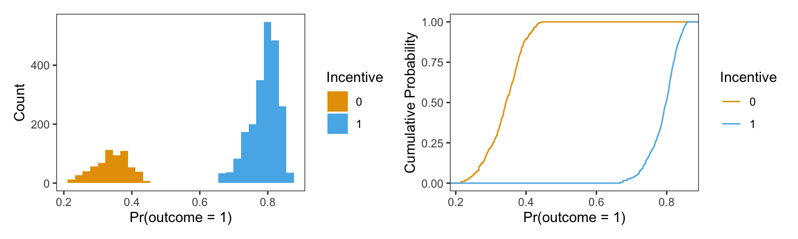
p = predictions(mod)

p = p.with_columns(pl.col("incentive").cast(pl.Utf8))

(
  ggplot(p, aes(x="estimate", fill="incentive")) +
  geom_histogram() + \
  labs(x="Pr(outcome=1) when incentive = 0")
).show()
(
  ggplot(p, aes(x="estimate", colour="incentive")) +
  geom_line(stat='ecdf')
).show()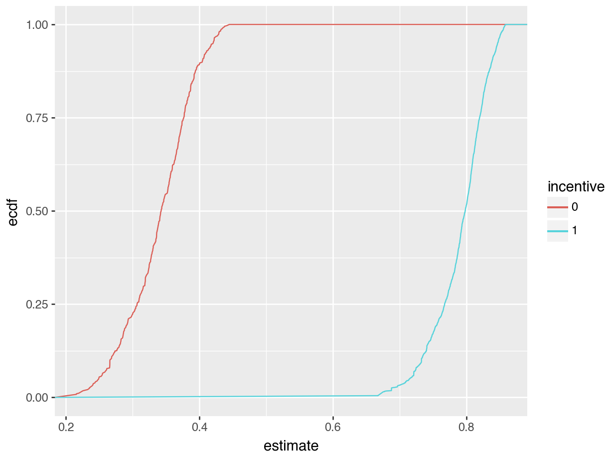
The left side of Figure 5.2 is a histogram showing the distribution of predicted probabilities for each individual in the observed dataset. As usual, the x-axis represents the range of predicted outcomes, while the y-axis shows the number of study participants in each bin. By assigning different colors to the bins based on the treatment arm (incentive equal 1 or 1), we highlight one key feature of the distribution: predicted outcomes for people in the treatment group tend to be much higher than predicted outcomes for people in the control group. Indeed, the distribution of outcome probabilities without an incentive (black) is concentrated between 0.2 and 0.4, indicating a low probability of travelinging to the test center. In contrast, the distribution of predicted outcome for participants who received a monetary incentive (grey) is concentrated between 0.70 and 0.85. This suggests that those who received an incentive are considerably more likely to seek their test results.
The right side of Figure 5.2 presents an ECDF plot. Again, the x-axis represents the range of predicted outcomes. This time, however, the y-axis indicates the empirical cumulative distribution, that is, the proportion of data points that are less than or equal to a specific value. For any given value on the x-axis, the height of the curve indicates the proportion of data points that are less than or equal to that value. For example, at 0.3 on the x-axis, we see that the incentive=0 line is close to 0.25. This means that about 25% of participants in our sample have predicted outcome smaller than 0.3. Where the ECDF curve is steep, we know that much of our data is concentrated in that part of the distribution. With this in mind, we see that many of our predicted outcome values are clustered near 0.3 in the control group, and near 0.8 in the treatment group.
5.6.2 Marginal predictions
So far, we have focused on the full distribution of unit-level predictions. Often, we want to marginalize those unit-level estimates to plot average estimates instead. The first approach to do this uses the by argument.
When we use this argument, the function will (1) compute predictions for each observation in the actually observed dataset and (2) average unit-level predictions across some variable(s) of interest. This is equivalent to plotting the results of calling avg_predictions() using the by argument.
For example, if we want to compute the average predicted probability that outcome equals 1, by subgroup, we execute this code.
avg_predictions(mod, by = "incentive")| incentive | Estimate | Std. Error | z | Pr(>|z|) | 2.5 % | 97.5 % |
|---|---|---|---|---|---|---|
| 0 | 0.340 | 0.01890 | 18.0 | <0.001 | 0.303 | 0.377 |
| 1 | 0.791 | 0.00862 | 91.7 | <0.001 | 0.774 | 0.808 |
avg_predictions(mod, by="incentive")shape: (2, 8)
┌───────────┬──────────┬───────────┬──────┬─────────┬─────┬───────┬───────┐
│ incentive ┆ Estimate ┆ Std.Error ┆ z ┆ P(>|z|) ┆ S ┆ 2.5% ┆ 97.5% │
│ --- ┆ --- ┆ --- ┆ --- ┆ --- ┆ --- ┆ --- ┆ --- │
│ str ┆ str ┆ str ┆ str ┆ str ┆ str ┆ str ┆ str │
╞═══════════╪══════════╪═══════════╪══════╪═════════╪═════╪═══════╪═══════╡
│ 0 ┆ 0.34 ┆ 0.0189 ┆ 18 ┆ 0 ┆ inf ┆ 0.303 ┆ 0.377 │
│ 1 ┆ 0.791 ┆ 0.00862 ┆ 91.7 ┆ 0 ┆ inf ┆ 0.774 ┆ 0.808 │
└───────────┴──────────┴───────────┴──────┴─────────┴─────┴───────┴───────┘We plot the same results using the plot_predictions() function.
p1 = plot_predictions(mod, by = "incentive")
p2 = plot_predictions(mod, by = c("incentive", "agecat"))
p1 + p2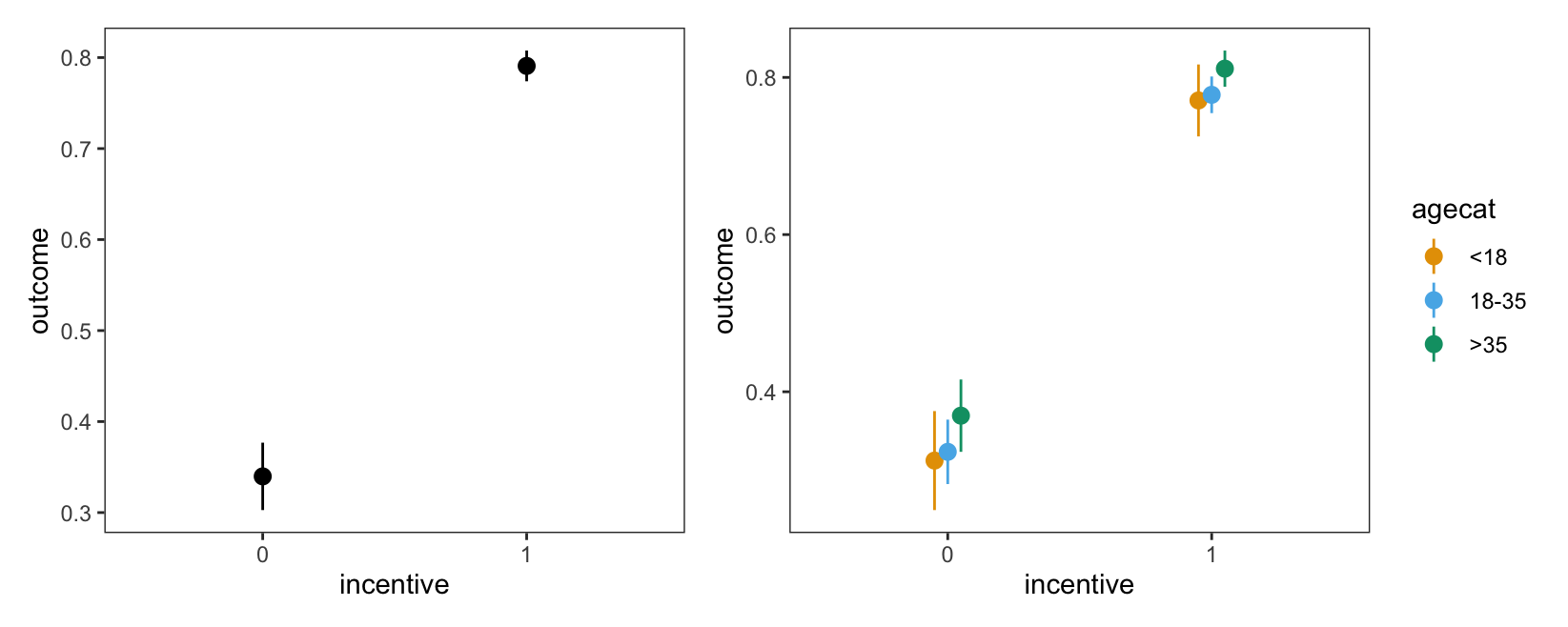
outcome equals 1.
plot_predictions(mod, by="incentive").show()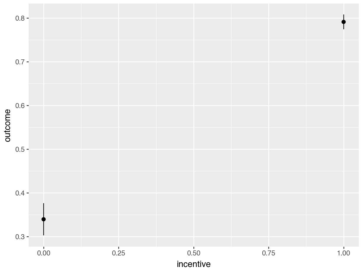
plot_predictions(mod, by=["incentive", "agecat"]).show()
These plots show that there is a very large gap between the predicted outcome for members of different incentive groups. In contrast, differences between age categories seem much more modest.
Note that the plot_predictions() function also accepts a newdata argument. This means that we can, for example, plot marginal means constructed by averaging across a balanced grid of predictors.13
plot_predictions(mod, by = "incentive", newdata = "balanced")plot_predictions(mod, by="incentive",
newdata = "balanced", draw = False)shape: (2, 8)
┌───────────┬──────────┬───────────┬──────┬─────────┬─────┬───────┬───────┐
│ incentive ┆ Estimate ┆ Std.Error ┆ z ┆ P(>|z|) ┆ S ┆ 2.5% ┆ 97.5% │
│ --- ┆ --- ┆ --- ┆ --- ┆ --- ┆ --- ┆ --- ┆ --- │
│ str ┆ str ┆ str ┆ str ┆ str ┆ str ┆ str ┆ str │
╞═══════════╪══════════╪═══════════╪══════╪═════════╪═════╪═══════╪═══════╡
│ 0 ┆ 0.332 ┆ 0.02 ┆ 16.6 ┆ 0 ┆ inf ┆ 0.293 ┆ 0.371 │
│ 1 ┆ 0.789 ┆ 0.0103 ┆ 76.6 ┆ 0 ┆ inf ┆ 0.769 ┆ 0.809 │
└───────────┴──────────┴───────────┴──────┴─────────┴─────┴───────┴───────┘5.6.3 Conditional predictions
In some contexts, plotting marginal predictions may not be appropriate. For instance, when one of the predictors of interest is continuous, where there are many predictors, or much heterogeneity, the commands presented in the previous section may generate jagged plots that are difficult to read. In such cases, it can be useful to plot conditional predictions instead. In this context, the word “conditional” means that we are computing predictions, conditional on the values of the predictors in a constructed grid of representative values. However, unlike in the previous section, we do not average over several predictions before displaying the estimates. We fix the grid and display the predictions made for that grid immediately.
The condition argument of the plot_predictions() function does just that: build a grid of representative predictor values, compute predictions for each combination of predictor values, and plot the results. In the following examples, we fix one or more predictor to its unique values (categorical variables) or to an equally spaced grid from minimum to maximum (numeric variables). The other predictors in the model are held to their means or modes.
p1 = plot_predictions(mod,
  condition = "distance"
)
p2 = plot_predictions(mod,
  condition = c("distance", "incentive")
)
p3 = plot_predictions(mod,
  condition = c("distance", "incentive", "agecat")
)
(p1 + p2) / p3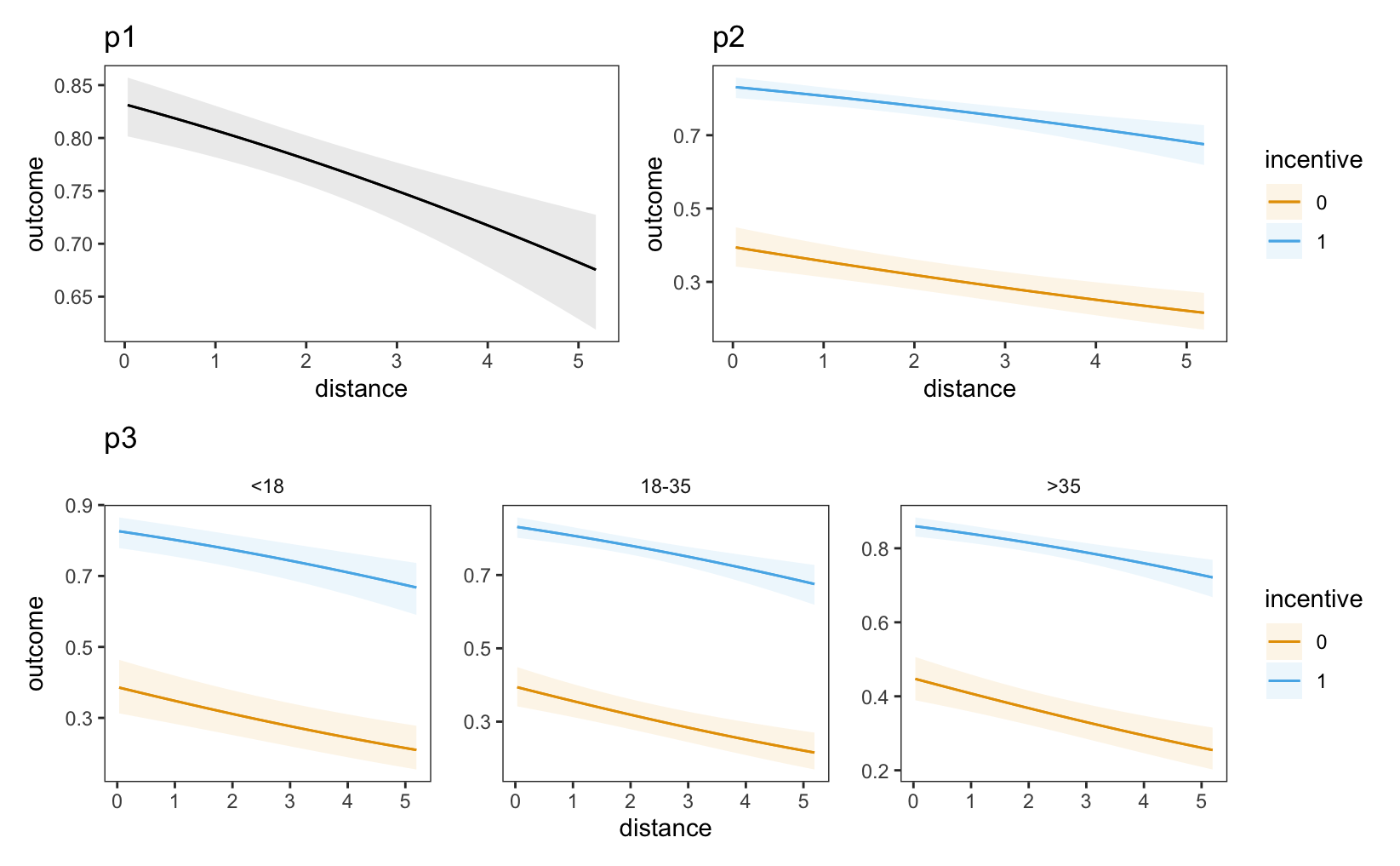
outcome equals 1, conditional on incentive, age category, and distance. Other variables are held at their means or modes.
In each of these plots, the predicted probability that outcome equals one is lower for individuals who live far from the test center (right side of the plot). Moreover, we see that the dashed line are far above the solid lines, which tells us that the predicted outcome is higher for individuals who received a monetary incentive.
One useful feature of the plot_predictions() function is that it allows us to set the value of some variables explicitly in the condition argument. For example, to plot the predicted outcome for an individual above 35 years old, who did not receive a monetary incentive, for different values of distance:
plot_predictions(mod, condition = list(
    "distance", "agecat" = ">35", "incentive" = 0
))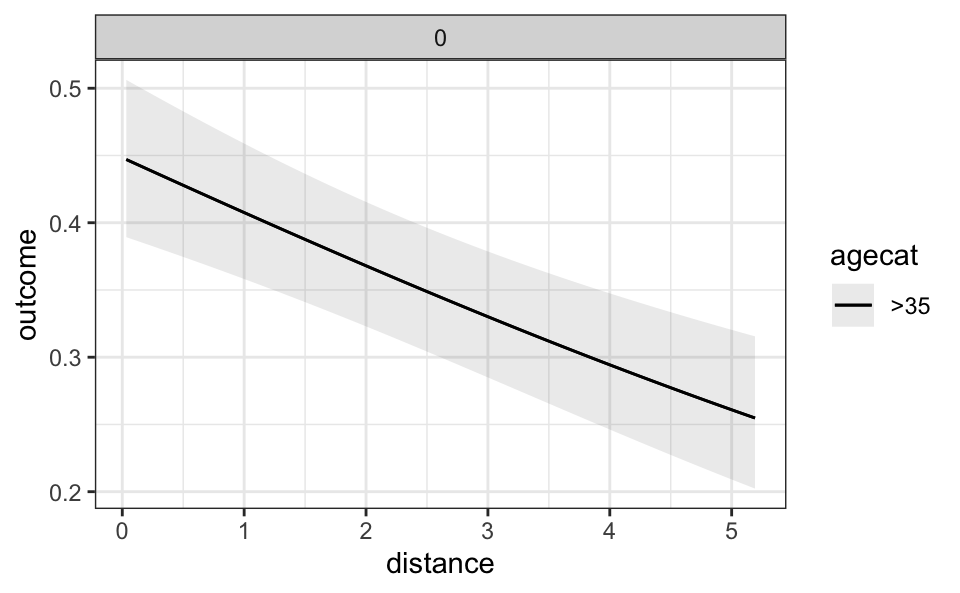
plot_predictions(mod,
  condition={"distance" : None, "agecat" : ">35", "incentive" : 0 }
).show()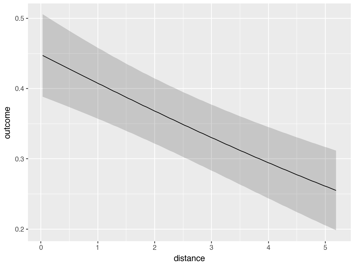
5.6.4 Customization
In R, the output of plot_predictions() is a standard ggplot2 object. In Python, the object is compatible with the plotnine library. This makes it very easy for users to customize the appearance of their plots. For example, we can change the style theme and add a rug plot like so.
plot_predictions(mod, condition = "distance", rug = TRUE) +
    theme_grey() +
    ylim(c(.65, .81)) + xlim(c(2, 4.5))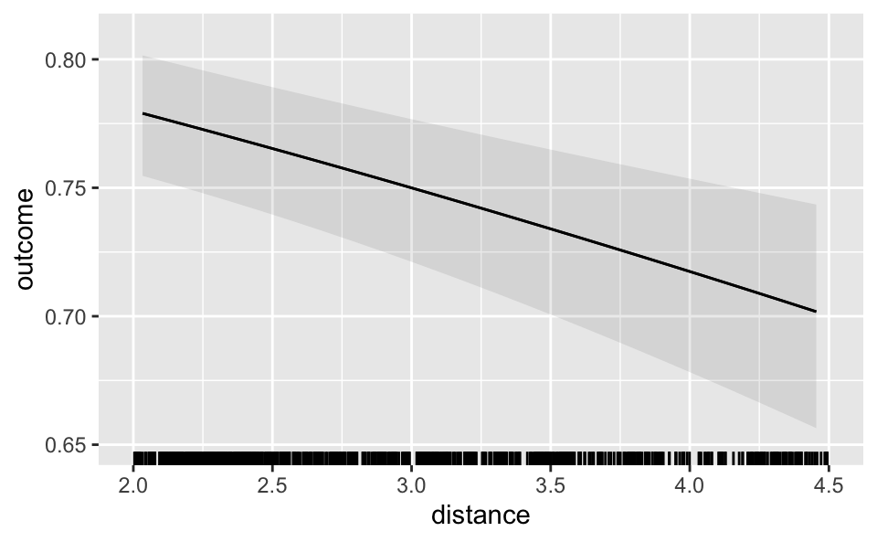
A more powerful but less convenient way to customize plots is to call the draw=FALSE argument. This will return a data frame with the raw values used to create plots. You can then use these data to create your own plots with base R graphics, ggplot2, or any other plotting functions you like.
plot_predictions(mod, by = "incentive", draw = FALSE) incentive estimate std.error statistic p.value s.value conf.low
1 0 0.3397746 0.018899189 17.97826 2.883944e-72 237.6508 0.3027328
2 1 0.7908348 0.008620355 91.74040 0.000000e+00 Inf 0.7739393
conf.high df
1 0.3768163 Inf
2 0.8077304 Infplot_predictions(mod, by="incentive", draw = False)shape: (2, 8)
┌───────────┬──────────┬───────────┬──────┬─────────┬─────┬───────┬───────┐
│ incentive ┆ Estimate ┆ Std.Error ┆ z ┆ P(>|z|) ┆ S ┆ 2.5% ┆ 97.5% │
│ --- ┆ --- ┆ --- ┆ --- ┆ --- ┆ --- ┆ --- ┆ --- │
│ str ┆ str ┆ str ┆ str ┆ str ┆ str ┆ str ┆ str │
╞═══════════╪══════════╪═══════════╪══════╪═════════╪═════╪═══════╪═══════╡
│ 0 ┆ 0.34 ┆ 0.0189 ┆ 18 ┆ 0 ┆ inf ┆ 0.303 ┆ 0.377 │
│ 1 ┆ 0.791 ┆ 0.00862 ┆ 91.7 ┆ 0 ┆ inf ┆ 0.774 ┆ 0.808 │
└───────────┴──────────┴───────────┴──────┴─────────┴─────┴───────┴───────┘5.7 Summary
This chapter defined a “prediction” as the outcome expected by a fitted model for a given combination of predictor values. A prediction is a useful descriptive quantity. It is an expectation or best guess for different individuals, units, or subgroups of the population of interest.
The predictions() function from the marginaleffects package computes predictions for a wide range of models. avg_predictions() aggregates unit-level predictions. plot_predictions() displays predictions visually. The main arguments of these functions are summarized in Table 5.1.
predictions(), avg_predictions(), and plot_predictions() functions.
| Argument | |
|---|---|
model |
Fitted model used to make predictions. |
newdata |
Grid of predictor values. |
variables |
Make predictions on a counterfactual grid. |
vcov |
Standard errors: Classical, robust, clustered, etc. |
conf_level |
Size of the confidence intervals. |
type |
Type of predictions: response, link, etc. |
by |
Grouping variable for average predictions. |
byfun |
Custom aggregation functions. |
wts |
Weights used to compute average predictions. |
transform |
Post-hoc transformations. |
hypothesis |
Compare predictions to one another, conduct linear or non-linear hypothesis tests, or specify null hypotheses. |
equivalence |
Equivalence tests |
df |
Degrees of freedom for hypothesis tests. |
numderiv |
Algorithm used to compute numerical derivatives. |
... |
Additional arguments are passed to the predict() method supplied by the modeling package. |
To clearly define predictions and attendant tests, analysts must make five decisions.
First, the Quantity.
- Predictions can be computed on different scales, depending on the type of statistical model. In generalized linear models (GLM), for example, one can make predictions on the “link” or “response” scales. In most cases, analysts should report predictions on the same scale as the outcome variable, since this is most natural for readers.
- The scale of predictions is controlled by the
typeargument.
Second, the Predictors.
- Predictions are conditional quantities, that is, they depend on the values of all the predictors in a model.
- Analysts can make predictions for different combinations of predictor values, or grids: empirical, interesting, representative, balanced, or counterfactual.
- The predictor grid is defined by the
newdataargument and thedatagrid()function.
Third, the Aggregation.
- To simplify the presentation of results, it often makes sense to report average predictions. Analysts can choose between different aggregation schemes:
- Unit-level predictions (no aggregation)
- Average predictions
- Average predictions by subgroup
- Weighted average of predictions
- Predictions can be aggregated using the
avg_predictions()function and thebyargument.
Fourth, the Uncertainty.
- In
marginaleffects, thevcovargument allows analysts to report classical, robust, or clustered standard errors around predictions. - The
inferences()function can compute uncertainty intervals via bootstrapping, simulation-based inference, or conformal prediction.
Fifth, the Test.
- A null hypothesis test aims to determine if a prediction (or a function of predictions) is different from a null hypothesis value. For example, an analyst may wish to check if two predictions are different from one another. Null hypothesis tests can be conducted using the
hypothesisargument. - An equivalence test aims to determine if a prediction (or a function of predictions) is similar to a reference value. Equivalence tests can be conducted using the
equivalenceargument.
Instead of defining our own
g()function, we could use the built-inplogis()function inR, orscipy.stats.logistic.cdf()inPython.↩︎When
datagrid()is called as an argument to amarginaleffectsfunction, we can omit themodelargument.↩︎Since the points are tightly clustered, they appear as a curve at low resolution.↩︎
This is the default approach taken by software packages like
emmeans(Lenth 2024).↩︎The plot is omitted because, in this particular case, it looks very similar to the one in Figure 5.3.↩︎